Logo
The CFPB logo was designed to symbolize vigilance, transparency, and a consumer focus. Consumers are the foundation and focus of our mission and our logo reflects that. A soft beam of light symbolizes our efforts to illuminate the financial landscape and foster transparency in the marketplace.
Lockups
Horizontal
The horizontal lockup is the primary option and appears on our stationery and website.

Specs
The logo is comprised of the following colors.
| Name | CMYK | PMS | RGB | HEX | |
|---|---|---|---|---|---|
| CFPB green | 80, 0, 100, 0 | 361 | 32, 170, 63 | #20aa3f | |
| Green 60 (Midtone Green) | 32, 0, 52, 0 | 358 | 173, 220, 145 | #addc91 | |
| Gray | 0, 0, 0, 77 | Cool Gray 11C | 90, 93, 97 | #5a5d61 |
Vertical
The vertical lockup is useful for square frames or narrow columns.

Isolated
The isolated logo is primarily used for internal-facing communications. For all external communications, the logo needs to be in a lockup with “Consumer Financial Protection Bureau” to ensure clear communication.

Small execution
The small execution lockup is used when the logo needs to scale down to less than 0.75” or 54 pixels at 72 dpi. The small execution logo allows “Consumer Financial Protection Bureau” to remain legible.

Variations
Spanish logo
The Spanish logo should be used for Spanish language materials, such as websites and microsites, publications, and signage.
This is applicable for the horizontal, vertical, and small execution lockups.

One color logo
When the logo is being produced for print formats conditions may not allow for full color. For these rare cases, the one-color logo may be used only in black on a white background.This is applicable for the horizontal, vertical, isolated, and small execution lockups.

Guidelines
Clear space
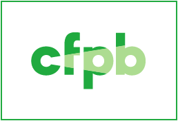
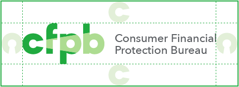
There should always be ample space around the logo to ensure maximum impact and keep the mark from looking cluttered.
Isolated logo clear space
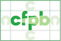
Vertical logo clear space

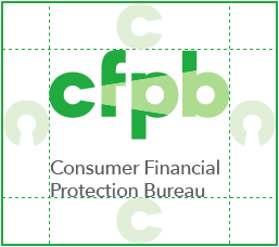
Horizontal logo clear space

Web scale
The small execution logo should be used to optimize legibility of the logotype on desktop and mobile applications. These are our benchmark sizes for web, but variance may be used for specific circumstances or constraints.
Desktop scale

- Lockup: small execution
- Height: 50px
- Padding: 25px
Mobile scale

- Lockup: small execution
- Height: 40px
- Padding: 20px
Print scale
The horizontal or vertical lockup should be used for most print applications. These are our benchmark sizes for 8.5 x 11” documents, including reports, brochures, powerpoints, and forms. For large-format print pieces, such as posters and banners, where the logo is used with a height greater than 1”, it should be used in increments of 1/2”.
8.5 x 11” documents

- Lockup: horizontal
- Height: 0.5”
- Clear space: 0.25”
8.5 x 11” documents

- Lockup: vertical
- Height: 0.77”
- Clear space: 0.25”
Complex backgrounds
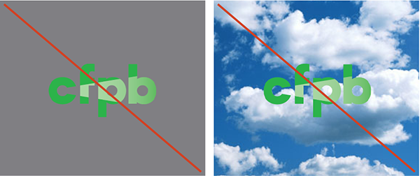
The logo should be shown on a white background for optimal appearance. When this is not possible, the logo must be contained in a white rectangle equal to the required clear space.
Color

Pattern

Photo

Supporting beam pattern
Compositions
A beam pattern is a graphic background element that can be paired with the CFPB logo. A beam pattern provides grounding and an engaging graphic reference to the beam concept in our logo.
Beam patterns are composed of overlapping beams that frame areas of white space used for titles, text, and other graphic elements. Beams always point horizontally, not vertically.

Solid green beam bleeds off the top of the layout. Beams alternate direction to create layered beam shapes.

Layered beams anchor to the bottom, leaving plenty of white space above for type. This works especially well for horizontal layouts.
Base shapes
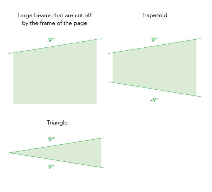
Beam patterns are created using trapezoids and parallelograms each at a 9° angle.
Color
Beam patterns include all three CFPB Green tones. Using transparency increases the strength of the beam metaphor. Transparency should be achieved through opacity, not blending modes like multiply / darken / etc.
Misuse
Don’t remove the light beam. It is essential to the logo.

Don’t stretch or condense. This weakens the brand.

Don’t apply a drop shadow.

Don’t outline the logo or use other colors. This dilutes brand association.

Don’t rotate the symbol. This changes the connotation of the light.

Don’t place the logo directly on a colored background or photo without a white bounding box.
