Sublanding pages
Sub-landing page types provide an overview of a topic and/or group of related content within a main navigation area. The sub-landing page template should always be used as a child page to the landing page template.
Similar to landing pages, the focus of these pages is enabling users to quickly understand a topic area and select the specific information that meets their need. Unlike the landing page, this template allows for lengthier content components to allow for further explanation of a topic if needed.
Types
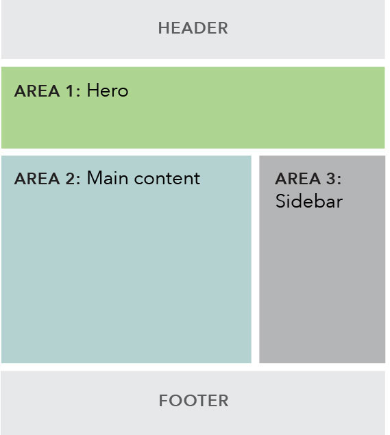
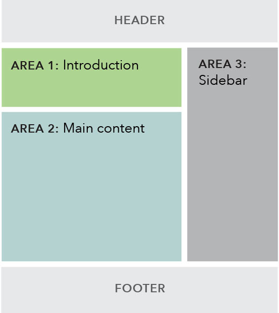
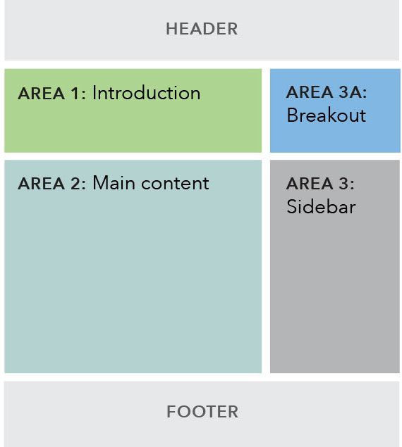
| With hero | With text introduction | With breakout sidebar |
|---|---|---|
 |
 |
 |
| Example: Payday loans | Example: Financial education for adults | Example: Rulemaking |
Use cases
When to use
- When creating a new topic area within one of the main navigation verticals.
- Target user is primarily in an explore mindset, so the main content of this page should be focused on introducing them to the topic and directing them to the specific content that will meet their needs.
When other options are better
- When page content includes multiple paragraphs of copy or more detailed definitions or explanations.
- When the desired user interaction is more geared toward encouraging users to sit down and read something or engage deeply with an interactive tool.
Guidelines
Content guidelines
- The content components should work together to create an overview of the information held within the section and how it relates back to the main navigation section.
- Should be written and organized in a way that aids the user in skimming and quickly navigating to lower-level pages where they’ll find the information they need.
- Components should work together to give users clear next steps and calls to actions; give them the opportunity to decide quickly what content is relevant to them and where they should go next.
- The default placement for contact information should be in the sidebar. Only use the main content area when contact information is of extra significance or directly ties into the main objective of the page.
- Page titles are sentence case and use the word “and” instead of “&”. (Note that navigation labels follows a different style.)
- While full width body copy (including bulleted lists) is an option in this template, it should be used sparingly.
Area 1: Introduction
- Choose between a hero or text introduction for this area.
- Option for using breakout sidebar variation of the text introduction.
Area 2: Main content
- Must contain at least 1 pattern, though the featured content module or well should not stand on their own.
- Recommended hierarchy of patterns: featured content module, info unit groups, wells, and full width body copy.
- Wells should not be used at the top of this area if the hero is used to introduce the page.
Area 3: Sidebar
- Must contain at least 1 component.
- If using both static and dynamic content, preference for dynamic content to appear above static content.
Behavior
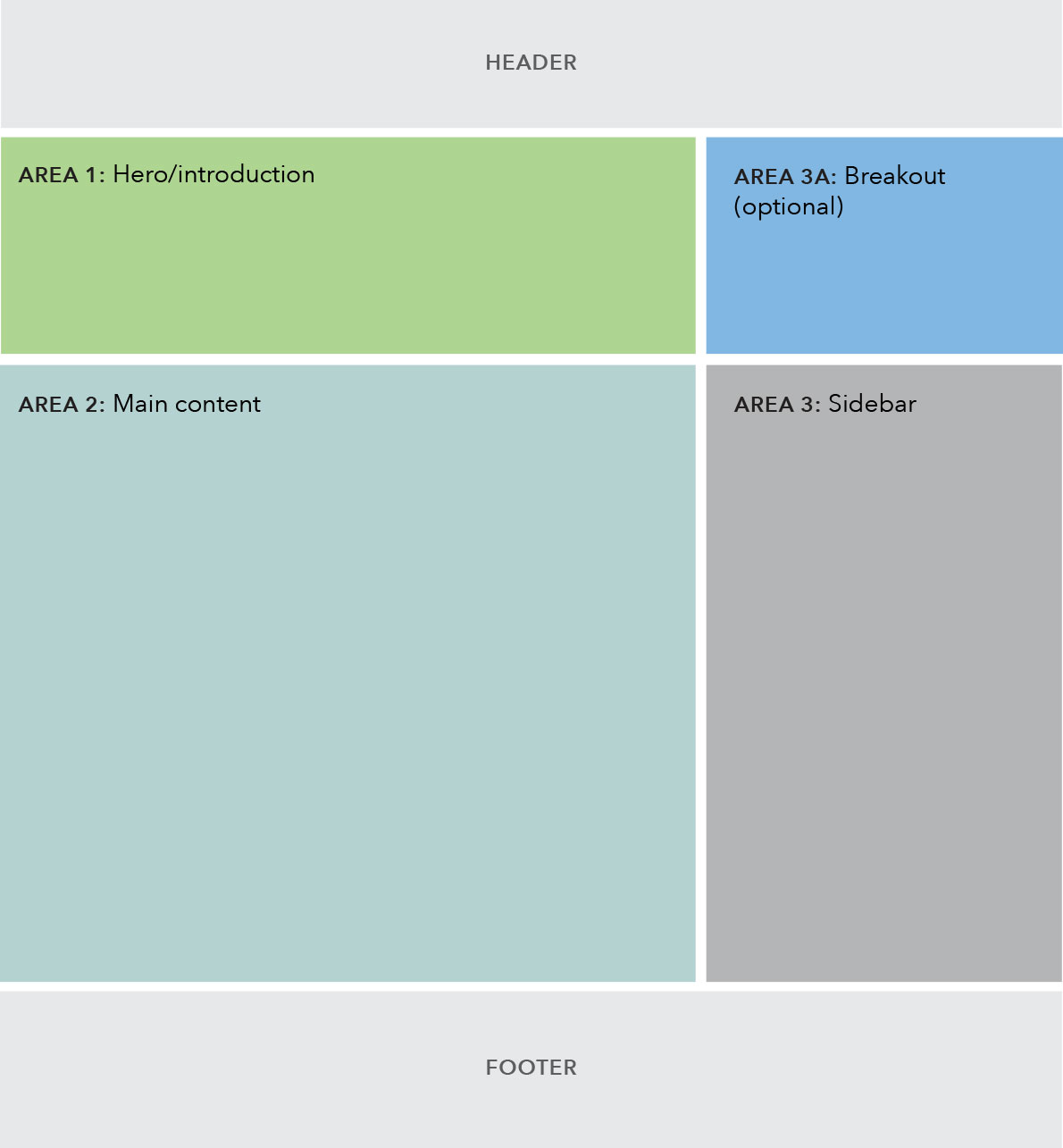
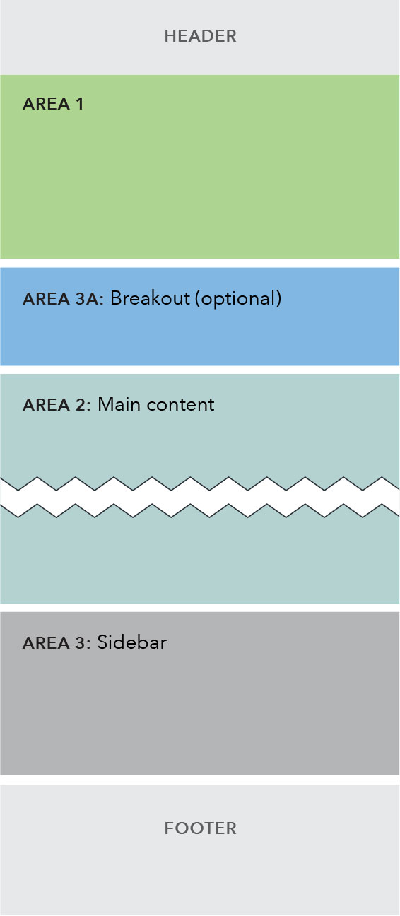
Below the 901 pixel breakpoint, the sidebar stacks below the main content area.
| Above 900 px | Below 901 px |
|---|---|
 |
 |